Changing the viewport meta tag with JavaScript
07 March, 2014 by Tom Elliott
Responsive Web Design, let’s face it, can be tricky. There are essentially two basic elements to make responsive websites work: CSS media queries, that change the styling of your site at different browser sizes using breakpoints and the viewport meta tag.
Without the viewport meta tag and even if your site uses CSS media queries, most devices will resize a website to the page to a standardish size of 900-1000 pixels, a common resolution for many fixed width websites.
Most responsive sites usually use the below standard viewport meta tag, with width=device-width. This tells the device that the page is as wide as the devices ‘logical resolution’, at a scale of 100%. An iPhone 4S for example has a logical resolution of 320×480.
<meta id="viewport" name=viewport content="width=device-width; initial-scale=1">
Device resolutions vary greatly, with one of the smallest resolutions found with the HTC Wildfire with a resolution of 240×320 pixels. This is pretty small, and if your website isn’t responsive to this size, there’s a good chance it will look terrible at this resolution.
You might have a responsive site for example that works well down to 480 pixels, but to get responsive down as low as 240 may involve resizing many elements and a disproportionate amount of work.
This is where dynamically changing the viewport meta tag can come in handy.
The JavaScript required to change the viewport meta tag is as follows.
if (screen.width < 480) {
 document.getElementById("viewport").setAttribute("content", "width=480");
}
This will set the width of the viewport to 480 pixels if the screen size is below 480 pixels, so no need to spend all that extra effort getting your site responsive below 480 pixels. I also find in some cases, a responsive website can look better when we have more pixel real estate available to smaller screens.
If you’re using jQuery, you can change the viewport tag using the below lines.
if (screen.width < 480) {
  $("#viewport").attr("content", "width=480");
}
Using the code above, you may find on some older, smaller screened Android devices resize the viewport to be wider than the device’s width and crop part of the page. I’ve found adding ‘initial-scale=0.5’ helps here, effectively resizing the content to the specified width.
if (screen.width <= 480) {
 document.getElementById("viewport").setAttribute("content", "width=480; initial-scale=0.5");
}
I use something similar on the new Web Dev Door site (coming soon). Partly because I would have needed to resize and position many elements and also because I felt the aesthetics of the site just looked better at a slightly larger resolution. Changing the viewport meta tag this way meant I only had to make minor adjustments such as increasing font sizes to make them legible without zooming.
Consider the following image.
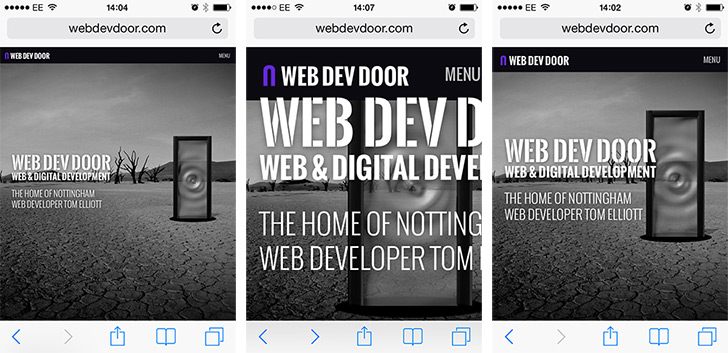
Viewport meta tag comparison. Left: No viewport tag, middle: default viewport and right: viewport resizing
The image on the left is how the new site looks when the viewport tag is omitted. As it has been resized to about 900 pixels, everything is small, text is hard to read and buttons are hard to click on without zooming. You can still get a responsive site to work this way, but you’ll need to spend a lot of time sizing and positioning elements to make them legible. The middle image uses the standard viewport meta tag, which renders the page at 320 pixels on an iPhone 4S. This looks horrendous, as I haven’t taken steps to make the site responsive right down to 320 pixels. The image on the right is one which has the viewport width changed for smaller screen resolutions and looks much better.
From the tests I’ve ran so far, the iPhone (4S and 5), iPad and Android devices (4.0.3 and above) seem to handle this viewport changing with JavaScript very well.
5 Comments
 Carsten says:
 Thank you. Five minutes ago I wondered how to make this work. My first intension was to do what Rolfes would have done 🙂
But I wasn’t sure if this would work. Still unsure …
Carsten says: “Rolfen”, of course. Rolfes is a German soccer player 😉
 Andy says:
 Thank you so much for sharing this, finally I have resolved the issue of viewport which has taken too much of my time lately.
 priyanka vyas says:
 its not working properly in ipad what can i do please help me.
Let’s face it, this whole viewport tag and media query business sucks. It took me a long time to figure out what it all means, it makes more sense, but still sucks. It’s limited, convoluted, quirky, ill-documented and sometimes just makes me want to puke.
Anyway, thanks for the tip! I was about to write javascript that would append a meta tag to head, but this is much better. It didn’t cross my mind!
Cheers