14 mobile UX factors that could impact SEO
22 May, 2014 by Tom Elliott

In a recent post, the impact of mobile UX on SEO, I explored how mobile user experience is (and will be) increasingly used to rank websites in mobile search. Google is always trying to find better ways to return the most relevant and useful search result to the user. Mobile sites that have poorly implemented user experiences are not very useful and can be very frustrating at times, especially when content is inaccessible.
It makes sense for search engines to treat mobile rankings differently than desktop rankings in regards to UX, as the usability of mobile sites can differ hugely from desktop versions.
In this post I explore in more detail some specific mobile UX factors that could harm your SEO and website ranking in mobile search.
I’ve split the below mobile UX factors into two groups; important and speculative. Important factors are ones I see really impacting on the user if the mobile experience is broken or poorly implemented. These factors are either currently being used by Google or there is strong reason to believe they will be in the near future. Speculative factors may never be used by search engines to help determine mobile rankings, but important nevertheless to mobile UX.
Even if many of these UX metrics don’t end up a ranking factor, they should still be considered to provide your visitors with a better mobile experience. The more usable a website is, the more people are likely to share your content thus giving your site more authority in search engines. From this point of view, there will always be an indirect effect of poorly implemented mobile UX and lower search rankings.
Important mobile UX Factors
1. Mobile page load speed
Page load speed is one of the biggest UX factors I see increasingly affecting mobile rankings. We already know that page speed is currently a ranking factor for both desktop and mobile. Although Matt Cutts explained in a Webmaster post 6 months ago that page speed wouldn’t affect mobile rankings any more than desktop, he indicated that this would not always be the case.
It would make sense; mobiles generally have much slower connections and if a site took an average of 5 seconds to load on mobile vs 1 second on desktop then mobile users are more likely to get frustrating with the site.
Take a look at the below page speed score for www.tomelliott.com within PageSpeed Insights.
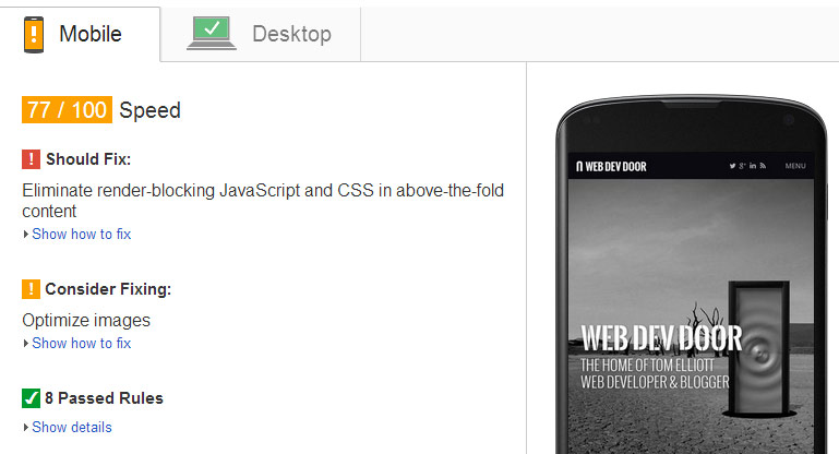
The site is responsive, and loads exactly the same code on desktop as it does on mobile devices. The page speed scores however are 77/100 and 89/100 for mobile and desktop respectively. This shows that page speed factors are treated differently in desktop than they are in mobile – at least within Insights scoring – with more points being deducted in mobile for factors like render-blocking JavaScript and CSS.
If Google are already scoring page speed differently on mobile vs desktop and highlighting how improvements can be made, I see this is a strong indicator that Google are moving towards separate ranking for mobile search based on page speed.
2. Broken layouts
If a website is rendered unusable or content inaccessible because little effort has been made in getting it to work on mobile, this would be very frustrating for a user and an important mobile UX factor. A broken layout could include things like content being overlapped by other page elements, navigation that is inaccessible, or partially visible content.
I often see this with poorly implemented responsive websites which can have a far worse UX than a site with no responsive considerations relying on standard resizing. Broken layouts maybe hard to detect algorithmically but I see Google increasingly trying to address this issue in the future. Why would a search engine want to send a user to a site that they will find of little use?
Take a look at the below web page as displayed on my iPhone 4s. Over half of the page width has been cut off, making the content impossible to read.

This is a problem I see frequently. The site owners have dropped in a viewport meta tag without making the site properly responsive through the use of media queries. This results in the site width of ~1040 pixels being cut off at the detected device’s width.
3. Content outside viewable area.
Content that requires horizontal scrolling because the width of the site is greater than the configured viewable area is bad UX. Unlike broken layouts which can take many forms, it’s relatively easy for Google to determine content outside a device screen. We can see this working in the Insights user experience metrics under ‘size content to viewport’.
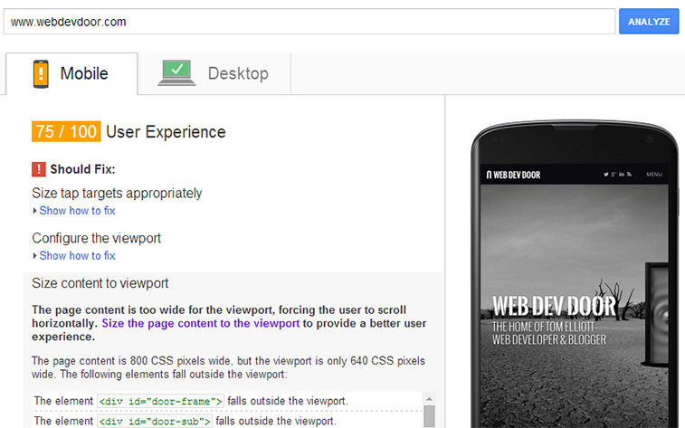
The above example shows what happens to the homepage of this site when I set the main container to a fixed width greater than the viewport width, creating a horizontal scrolling window. As Google can measure this UX factor, I would think it’s a prime contender for a future mobile ranking factor.
4. Faulty mobile redirects
Have you ever selected a link from a mobile and been taken to a separate page from what you were expecting? This is how Google would classify a ‘faulty redirect’ and have stated that faulty redirects impact rankings for mobile search. Faulty redirects are a potential issue with separate mobile specific sites and should not occur on responsive sites which usually have the same URL structure.
5. Use of Flash and other plugins
Pages that deliver Rich Media such as video or audio using non mobile compatible technology such as Flash, Silverlight or QuicktimeVR are unlikely to rank as highly in mobile search, especially if the media is the primary focus of the page. Google have already stated this in their changes to smartphone search rankings article (last point).
Plugins like Flash still have their place on the web (albeit a shrinking one) and are especially useful when it comes to supporting older non-HTML 5 browsers. The use of plugins without appropriate HTML 5 fallback however is bad for mobile UX and bad for rankings.
6. Cross linking between sites
When implemented correctly, a separate site as a mobile solution shouldn’t be penalized in search rankings and Google tends to do a good job of identifying mobile content. A common issue however is when the same content that is shared across mobile and desktop have non-mobile URLs linked within mobile content or vice versa.
Even if redirected correctly, the very presence of of the redirects and the extra request can be detrimental to both the user experience and rankings.
7. Content hidden to mobile.
When creating dynamic and responsive websites for smaller screens, we often hide blocks of content in order to display later through the use of meta queries in CSS or JavaScript. If the display of hidden content is not triggered on mobile deceives – whether through intention or by accident – this content should not be used to help mobile rankings.
Hidden content however, especially if later revealed through JavaScript I would expect to be very hard to detect algorithmically as it relies on user interaction. If Google could reliably differentiate between hidden content that can be revealed vs hidden content that cannot be revealed at all, this would make it a good mobile UX ranking factor.
8. Use of responsive web design
If a user has to spend additional time pinching and zooming in order to be able to read the content, this can be considered detrimental to the user experience.
A good responsive website should mean that content is initially legible without having to zoom, at least for most visitors. Google have also made it clear that a responsive site is their recommended method for delivering a mobile content over other techniques such as a separate mobile version. A separate mobile site is essentially a duplication of content and can have a number of issues like the ones discussed in previous steps.
This makes the use of responsive design an important future mobile UX ranking contender.
Speculative mobile UX factors
9. Zoom prevention
Preventing users from being able zoom in and out on websites (even with a well created responsive sites) can be, in my opinion, one of the worst mobile UX features. I see variations of the following viewport meta tag all too often:
<meta name="viewport" content="device-width, initial-scale=1, maximum-scale=1, user-scalable=no">
Even if your site is fully responsive and fonts are nice and legible, this may not be the case for people with poor eyesight. Restricting zoom I think can be a major frustration for some and should be avoided – there’s no good reason for user-scalable=no to be added to the viewport tag.
I wouldn’t be surprised to see this as a mobile UX ranking factor in the future.
10. Legible fonts.
Mobiles have always been designed to easily be able to zoom in on small website text, however this still requires an extra action and text that is initially legible will usually signal a better user experience.
The use of ledgible fonts is also one of the top mobile UX ranking factors in Insights
11. Presence of viewport tag
The presence of the viewport tag is another UX metric in Insights. It is easy to detect and usually indicates a responsive site. Using the tag alone however doesn’t indicate good user experience and poor implementation can result in a bad mobile experience. I think this factor, at least by itself, is less likely to be a future ranking factor.
12. Size of click targets
Small links and buttons can be easy to miss for round fingers and big thumbs, especially when links are adjacent to others. A millimetre or two can make all the difference between a wrongly selected link.
Google have already identified ‘small click targets’ as a UX metric in its Insights score and a possible candidate as a future mobile ranking factor.
13. Ads blocking content
If Google could reliably and algorithmically detect blocking of content by adverts, I would think this would be a good mobile UX ranking target. I frequently come across sites with advertising that render content largely or completely unreadable through advert overlays, or ads that target and reposition themselves under finger click.
Even sites with a single horizontal banner overlay on the footer or header I find frustrating as it reduced the viewable content area and increases the frequency I have to scroll.

The site above for example has sticky adverts overlaying content, making the page almost impossible to read. This might be accidental, as on desktop the adverts are either side of the content but it still makes for a poor user experience.
14. Bounce rate & time on site
Bounce rate or time on site has never really been a search engine ranking factor; high bounce rates on a blog for example can be seen as a positive indicator as visitors may find what they want straight away before leaving.
If however mobile bounce rates or the average time spent on the site are much lower on mobile than desktop for the same pages, this could well suggest problems with mobile UX. It would not be surprising if these metrics could be used in the future to help determine such issues which in turn may impact rankings.
Summary
As access to the web becomes more fragmented and increasingly accessed through smaller screen devices on the move, mobile UX is becoming increasingly important. We have seen how Google have already taken steps in certain aspects of mobile UX in helping to determine how content should be ranked for mobile search. Although user experience factors may only count for a small proportion of the overall ranking algorithm, this is only likely to increase in future.
SEO however shouldn’t be the biggest concern to influence the creation of a great mobile user experience – your visitors should be. The easier your content is viewed on a mobile, the greater the chance you’ll get conversions, shares and links which in turn will help improve your authority in search engines.
Related posts
The impact of mobile user experience on SEO »
4 Comments
-
Hi Rick, thanks for your comment. I would actually love to see this feature being disabled by devices as it can be terrible for usability.
 Greg says:
 So are we thinking that disabling zoom is just the site’s attempt to communicate to Google “hey, look, this is a legit mobile theme. We don’t even allow people to zoom because nobody would need it, we’re so mobile.” ?
Does that work?
-
Hi Greg, I wouldn’t have thought Google would ever look on zoom prevention in a positive light. Even if a site owner thinks nobody would need to zoom on a well developed responsive site, a small proportion of users may still want to pinch-zoom e.g. to get a close up of an image, or if a user is partially sighted.
I’ve come across more and more sites that have gone responsive and I’m extremely frustrated with the ones that disable pinch and zoom. Being old with fairly poor eyes it’s beyond me why a developer would decide that not only certain functions are my device are not needed but they can decide what size is close enough for everyone.
So thanks for not being in that camp.